
TL;DR

Get decor and gifts delivered free with Prime
- Fast, free delivery on millions of items
- Prime Video, Amazon Music and more included
- Member-only deals all year
Spooky Halloween wall art sets the mood for a room, party, or storefront without taking up floor space. Pick one style and a limited palette, arrange pieces around a clear focal point, and check wall and product instructions before hanging anything. Good lighting, secure mounting, and careful storage help your display look polished and return next October.
A bare wall can change a room faster than a skeleton in the doorway. A few well-placed prints, silhouettes, or eerie portraits give you a spooky Halloween wall without crowding the sofa, walkway, or party table.
The trick is not to hang everything you own. Choose a mood, repeat a small set of colors, and give the eye one place to land. A sepia haunted-house print beside a black cat silhouette feels intentional; six unrelated posters can look like a last-minute costume swap.
This guide walks you through choosing a style, building a display on a budget, arranging a gallery wall, and hanging and lighting your pieces safely. You’ll also find practical ideas for renters, family rooms, and small storefronts—because art helps set the atmosphere before a guest even reaches the door.
Choose one main Halloween mood and repeat a limited palette or motif across the wall.
Use a focal print, vary surrounding sizes, and test the gallery layout on the floor before hanging.
Check mounting-product instructions and your wall surface; “removable” does not guarantee damage-free removal.
Test dark artwork in evening lighting and keep lights, cords, and decorations clear of heat sources and walkways.
Store prints flat, protect frames, keep decorations dry, and label boxes by room or style.
Choose a Halloween art style that fits your room
Spooky Halloween wall art works best when you choose a clear mood first: gothic, vintage, playful, or eerie-minimalist. That decision guides the colors, imagery, and frames, so separate pieces feel like a collection instead of a jumble. It matters because people read a wall as one composition before they take in its individual prints. “Spooky” can mean a shadowy Victorian portrait or a smiling ghost with a pumpkin; it does not have to mean graphic horror.
For a gothic look, try black frames, deep plum accents, and a raven or botanical illustration. The dark colors create depth, but on a dim wall they can also merge into one shadow, so contrast and lighting matter. Vintage Halloween art often uses faded orange, cream, and sepia, as if a postcard spent decades in a trunk. Its softer palette can feel welcoming in a lived-in room, though it may have less dramatic impact from across a large space. For a family room, friendly ghosts, crescent moons, and storybook bats make the display festive without startling younger kids.
Imagine your entryway has warm wood floors and cream walls. A pair of sepia prints and one small black cat silhouette will likely sit more comfortably there than a wall of neon orange skulls. The first choice borrows colors already in the room, so the seasonal art feels integrated rather than temporary; the second may create a bolder contrast but compete with existing furnishings. If you love maximalist rooms, you can use more pieces, but repeat a color or motif to give the eye a thread to follow. In a small room, restraint often makes each detail easier to notice; in a larger room, a few more pieces may be needed to hold the wall together.
Styles you can build around include:
- Victorian and gothic: ravens, old portraits, dark botanicals, and ornate frames.
- Vintage Halloween: pumpkins, black cats, and aged-paper colors.
- Playful or kid-friendly: smiling ghosts, bats, and storybook scenes.
- Minimalist: a single large silhouette or a restrained black-and-cream print.
When several people share the space, ask what “spooky” means to them before you print or buy anything. A child who likes cartoon ghosts and an adult who wants a haunted mansion can usually meet in the middle with a warm, vintage palette. This small conversation can prevent wasted purchases and helps the display feel considered by everyone who uses the room.
As an affiliate, we earn on qualifying purchases.
Create a polished display on a small budget
You can make a Halloween wall feel designed for very little money by combining a few coordinated focal pieces with simple homemade accents. Printable art, reused frames, and paper silhouettes cost less than buying a complete matching set, while a shared palette makes the pieces look related. The wall can create a big visual impact without taking up floor or table space. The tradeoff is that DIY pieces may vary in paper quality, finish, or size; a consistent palette and careful spacing help those differences look deliberate rather than accidental.
Start with two or three prints that share one feature, such as black line art or faded orange backgrounds. Add handmade bats cut from black paper, or frame a page from an old book if you’re comfortable using a page you no longer need. A 20-by-30-inch statement print can anchor a narrow wall; smaller 8-by-10-inch pieces can fill the space around it. The larger piece gives the display a clear center, while smaller work adds detail without demanding the same budget. Before printing, check the intended frame size so you don’t spend extra on resizing or leave distracting gaps.
Here’s a practical, low-cost sequence for a hallway that feels empty every October:
- Pick a palette: choose two main colors, such as black and cream, with orange as a small accent. Limiting colors makes inexpensive pieces feel related and keeps a narrow hallway from looking visually busy.
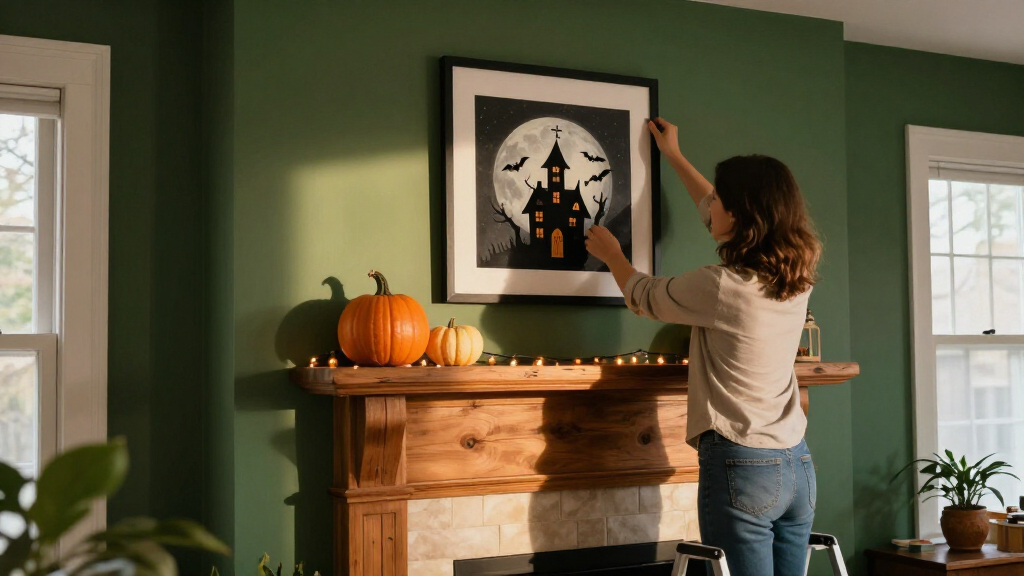
- Find your focal piece: print or make one larger image, such as a moonlit house or a dramatic raven. A clear focal point helps the display read quickly as people pass through rather than asking them to inspect every small item.
- Reuse what you have: put smaller prints in frames already stored in a closet, even if their finishes differ. Reuse saves money, though mismatched frames can distract; repeating a color elsewhere in the display can make their variation feel intentional.
- Add one handmade detail: cut a row of bats or make a paper garland, leaving space around each piece. A small accent adds depth, but too many craft elements can compete with the art and make the wall harder to pack away.
- Test the view: step back from the doorway and check whether the main image reads clearly. This catches problems that aren’t obvious up close, such as a focal print hidden behind a door swing or a cluster that looks uneven from the main approach.
For a temporary display, lightweight paper and fabric can be convenient, but suitability depends on the wall and the item. Check product guidance before applying adhesive, especially to delicate paint, wallpaper, or textured surfaces. A “removable” label is not a promise that every finish will come away untouched. Choosing light pieces can reduce the need for heavier hardware, but it does not eliminate the need to check surface compatibility.
A real-world example: a renter with a white hallway can use three printable prints in existing frames and a few paper bats attached with a product approved for that surface. The result feels layered and festive, but the decorations avoid the floor and can be packed flat after the holiday. If the wall’s finish is delicate or the product instructions are unclear, skipping the adhesive accents is a reasonable tradeoff: a simpler arrangement is better than risking repair costs.
Arrange a gallery wall that looks planned, not crowded
A Halloween gallery wall feels balanced when one piece leads and the surrounding art supports it. Start with a central image, vary the sizes around it, and repeat a color or subject so the arrangement feels connected. This structure gives viewers an easy entry point, then lets them notice smaller details. It works whether you’re hanging three prints over a console or filling a larger living-room wall, though a bigger wall may need a wider arrangement or more visual weight to avoid looking sparse.
Lay the pieces on the floor before putting anything on the wall. Try a large haunted-house print in the middle, two smaller portraits on one side, and a silhouette or framed quote on the other. Keep the gaps visually similar—around 2 to 3 inches often works for a compact arrangement—and step back from the doorway to see what a guest will notice first. Planning on the floor makes it easier to compare layouts and reduces unnecessary holes or adhesive changes. Treat the spacing as a guide rather than a rule: larger pieces may need more breathing room, while a tight cluster can suit a small entry.
Think of a gallery wall like a dinner conversation: the central print starts the story, while the smaller pieces add their own voices. If every item is the same size and equally dark, the wall can feel flat because no image takes priority. Mix a broad print with a small shadow-box piece or fabric banner, then leave a little empty wall so the arrangement can breathe. Variety creates interest, but too many different materials or frame styles can make the display feel scattered; repeat at least one visual feature to keep the mix coherent.
Placement matters as much as the art. Keep pieces visible from common viewing spots, and do not block doors, windows, thermostats, or required signs. In a narrow entry, hang the largest piece where people naturally look while coming in, but leave enough clearance that bags and coats won’t snag it. This may mean choosing a smaller focal print over a larger one: visibility and safe clearance matter more than filling every available inch.
For a small storefront, a coordinated display behind the counter can catch a passerby’s eye without using merchandise space. A single bold witch illustration, flanked by two smaller prints in matching frames, often reads more clearly from the sidewalk than a crowded cluster. That simplicity helps at a distance, where small details disappear. If you use digital art or a screen, check how glare and daylight affect visibility before relying on it as your main feature. A screen can change scenes easily, but it also depends on power and viewing conditions; physical prints are less flexible but do not need a display device.
Hang spooky art without damaging walls or creating hazards
Safe Halloween wall art starts with matching the hanging method to the artwork’s weight, the wall surface, and the product directions. Lightweight paper may work with an approved removable mounting product; a heavy frame needs hardware rated for its load and wall type. No single hook or adhesive works for every painted, wallpapered, or textured surface. This matching matters because a mount that holds on one surface may fail on another, while an overly aggressive product can leave marks when removed.
Read the package instructions before you mount anything, and test a small, discreet area if the product guidance allows it. For a delicate painted wall, a small paper silhouette may be a gentler option than a thick frame. If you’re hanging a heavier mirror-like frame, use suitable hardware and ask a qualified installer if you’re uncertain about the wall or attachment point. There is a practical tradeoff: lighter decorations are often simpler to install and remove, but heavier framed art can look more finished and may be more durable. Choose based on the wall’s limits, not just the look you want.
Keep decorations away from heat sources and out of paths where someone could brush against them. That matters near a doorway where guests arrive carrying coats, or beside a stair rail where a loose banner could snag. A display should set a mood—not become an obstacle in the dark. In a party setting, leave extra clearance where people are likely to gather or move quickly; a decoration that is safe in an empty room may become a snag or impact risk when the space is busy.
Safety note: Secure heavier frames with appropriate hardware, keep decorations clear of heat sources and walkways, and follow the instructions supplied with mounting products and lights.
Lighting can reveal details in dark artwork, but use fixtures and decorative lights according to their instructions. A small accent light can make a black raven visible against a charcoal print; a light aimed too close to paper or fabric may create an avoidable hazard. Battery-powered lights can suit some displays, but still check the manufacturer’s directions and inspect them before use. The goal is enough light to read the image, not maximum brightness; adding more lights can increase glare, clutter, or heat without improving the display.
If your plan involves electrical work rather than a plug-in decorative light, use a licensed electrician and follow local code and permit requirements. Turn power off at the appropriate source before any permitted work, use proper protective equipment, and don’t improvise wiring for a seasonal display. A temporary decoration is not worth creating an electrical risk.
Make dark artwork visible with gentle lighting
Spooky Halloween wall art needs enough light for viewers to see its shapes and details, even if the room itself feels dim. Black-on-charcoal images can look dramatic at noon and disappear after sunset, so test the display under the lighting you’ll actually use. A small, gentle accent light can reveal a raven’s feathers or the windows in a haunted-house print without washing out the whole room. The aim is legibility with atmosphere: if the details vanish, the mood becomes muddiness; if the whole wall is brightly lit, it can lose its mystery.
Compare the art with its surroundings before you hang it. A pale ghost on a dark wall has strong contrast, while a dark silhouette on a similarly dark wall may need a brighter nearby lamp. Turn on the lamps at the time you expect guests to arrive and look from the doorway, sofa, or sidewalk. That gives you a more useful view than checking the wall only in daylight. It also helps reveal glare from glass or reflections that may not be visible when you inspect the print up close.
For example, a shop owner displaying a vintage orange-and-black poster in a bright front window may not need extra lighting during the day. At night, reflections from the glass can compete with the image. Moving the print away from direct glare or adjusting the room’s existing light may help more than adding another fixture. That approach can preserve visibility without adding cords or equipment, though it may mean shifting the display from the ideal daytime position.
Digital displays and projection effects offer movement and easy changes, but they depend on the room. A projector’s ghostly silhouette may look crisp in a dim living room and washed out in a sunlit storefront. Physical prints stay visible without a screen or power source, while digital art can switch scenes in seconds; choose based on the lighting and equipment you have. The flexibility of digital art comes with a dependency on power, screen brightness, and suitable conditions, while a physical print is simpler but cannot change its image at a touch.
For any light or projection device, follow the manufacturer’s placement, operation, and clearance instructions. Keep cords out of walking routes, and do not place lights where they can heat paper, fabric, or other decorations. A subtle glow is enough: the wall should feel atmospheric, not like a display aisle.
Store your decorations so next October is easier
Good storage keeps Halloween wall art clean, flat, and easy to find when the season returns. Remove each item according to its product instructions, then separate framed work, paper pieces, fabric banners, and adhesive decorations. A little care now prevents bent corners, dust, and the unpleasant surprise of a damp print next year. Sorting by material matters because a framed piece needs corner protection, while loose paper is more vulnerable to creasing and moisture.
Store loose prints flat between protective sheets, and wrap framed pieces so their glass and corners do not knock against other items. Fold fabric banners along their existing seams where possible, rather than crumpling them into a box. Keep everything dry, and label the container by room or style—“entryway vintage art” is more helpful than “Halloween stuff.” The extra effort reduces setup time next season and makes it less likely that delicate pieces will be damaged by heavier decorations stored on top.
Reusable frames and durable fabric pieces can make future decorating easier, while flat-stored prints take up less space than bulky props. If you have a set of removable decals, keep them with their backing and instructions when the manufacturer’s guidance permits. Do not assume a product can be reused simply because it looks intact after removal. Reuse can save money, but only when the item still adheres and the manufacturer allows it; replacing a worn decal may be more reliable than discovering it will not stay put during setup.
Imagine opening your storage box next September and finding a black cat print with crisp corners, a clean banner, and a small note that says where each piece went. You can rebuild last year’s display in minutes—or change it up without digging through tangled decorations. That is one advantage of a wall-focused setup: many pieces store neatly and do not compete with everyday furniture.
Some gothic, vintage, or dark botanical prints can stay up all year if they suit your home. A black botanical illustration may feel right in a study in February, while a bright jack-o’-lantern print may read as purely seasonal. Let your room decide; the calendar does not have to dictate every frame. Keeping versatile art on display saves storage space, while seasonal pieces give you the pleasure of a fresh change each year.
Frequently Asked Questions
What styles of spooky Halloween wall art can I choose?
You can choose gothic and Victorian imagery, vintage pumpkins and black cats, playful ghosts, minimalist silhouettes, or haunted-house scenes. Popular styles vary by audience and year, so pick the mood that fits your room and the people who use it. Repeating a couple of colors helps different prints feel like one display.
How can I decorate a Halloween wall on a budget?
Try printable art, reused frames, and handmade paper silhouettes before buying a full set. Choose one focal print and repeat its colors in smaller pieces, such as black bats around a cream-and-orange poster. A few coordinated items can look more polished than a large mix of unrelated decorations.
How do I hang Halloween art without damaging the wall?
Check the mounting product’s instructions and match it to your wall surface and the artwork’s weight. Test a discreet area when the product guidance allows, especially on delicate paint, wallpaper, or textured walls. For heavy frames, use suitable hardware or ask a qualified installer rather than relying on a lightweight adhesive.
What Halloween wall art works well for children?
Friendly ghosts, pumpkins, smiling bats, and storybook haunted houses keep the theme festive without making the room too frightening. Let children help choose the scare level, especially for art near a bedroom or play area. A cheerful print can still feel seasonal when paired with black paper bats or a moonlit background.
Can I leave Halloween wall art up all year?
Some pieces work beyond October, especially dark botanical prints, ravens, vintage portraits, and restrained gothic art. Highly seasonal images, such as a bright jack-o’-lantern or a trick-or-treat sign, may feel more temporary. Choose frames and colors that already suit your room if you want to keep the art on display.
How should I light dark Halloween artwork?
Test the art at the time of day you expect people to see it, then use gentle accent lighting if details disappear. Watch for glare on glass and reflections in storefront windows. Follow the light’s instructions, keep cords out of walkways, and keep fixtures away from paper or fabric that could be affected by heat.
Conclusion
The strongest Halloween wall is rarely the busiest one. Choose a mood, give the wall a clear focal point, and repeat a couple of colors so even affordable prints feel connected. Then check the hanging and lighting instructions before you call the display done.
Keep the floor clear, leave the artwork room to breathe, and let one shadowy print do its work. Sometimes a quiet black cat is spookier than a whole room full of props.
Halloween Picks
halloween
As an affiliate, we earn on qualifying purchases.